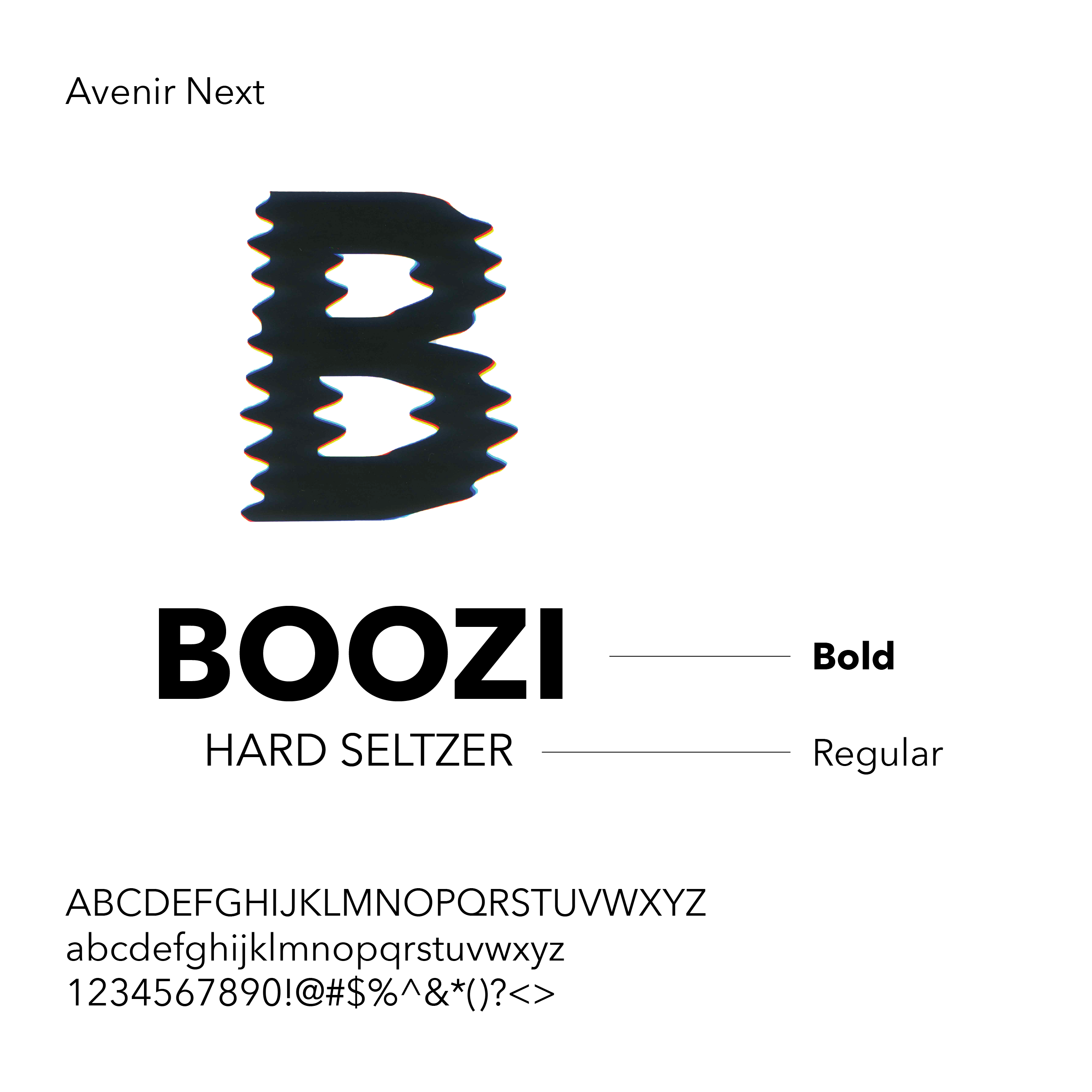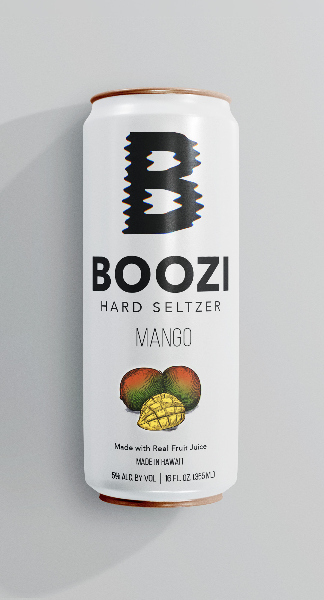
Boozi Hard Seltzer
For this project, I was tasked with creating graphic typography in the context of retail packaging. With the freedom to choose any drink, I decided to create a hard selter. Once I settled on that direction, I began thinking about how to design the layout to resonate with my target audience—adults aged 21 and over.
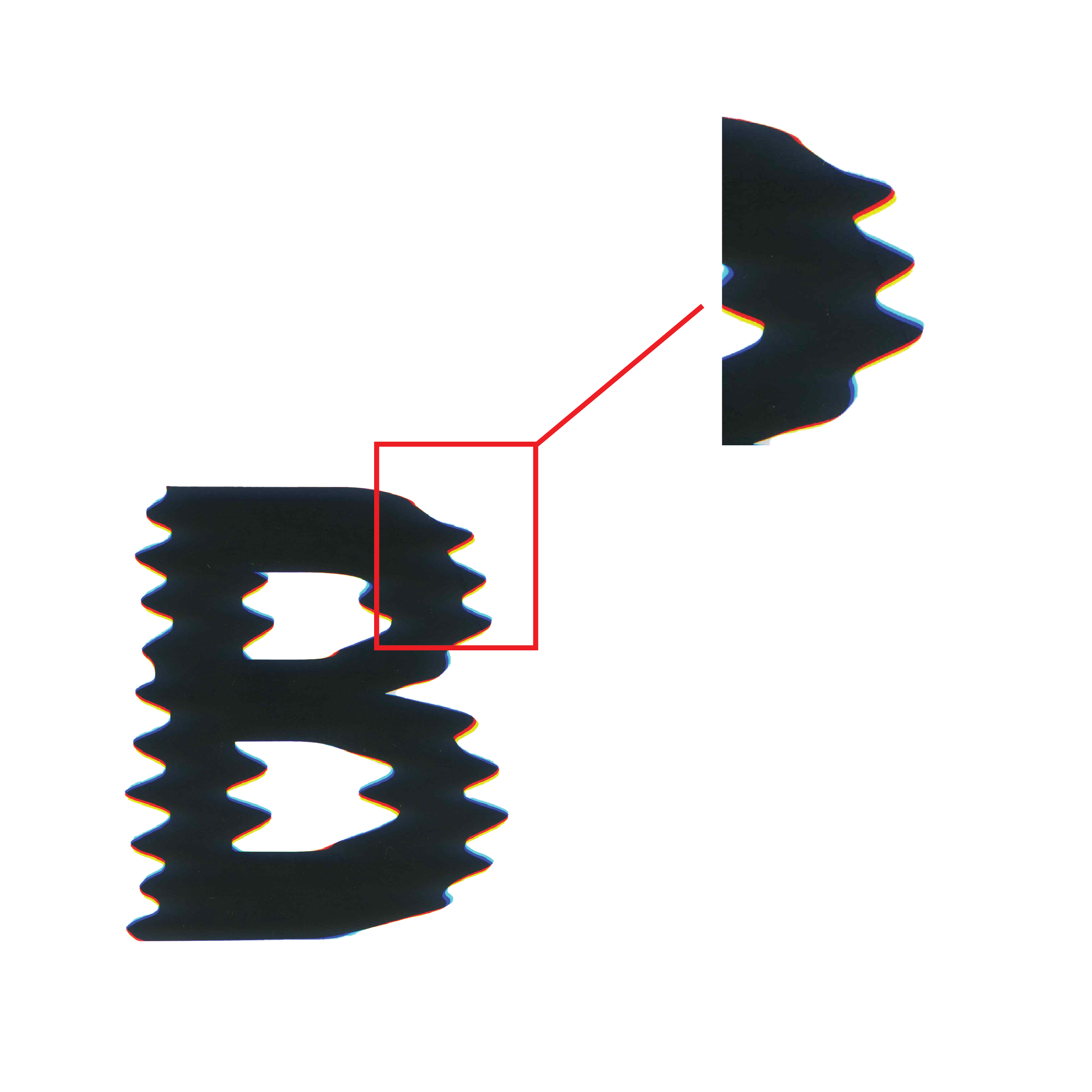
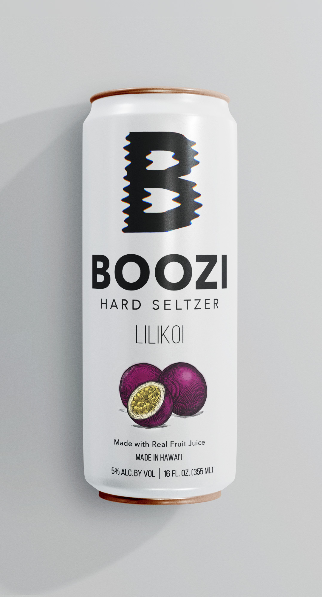
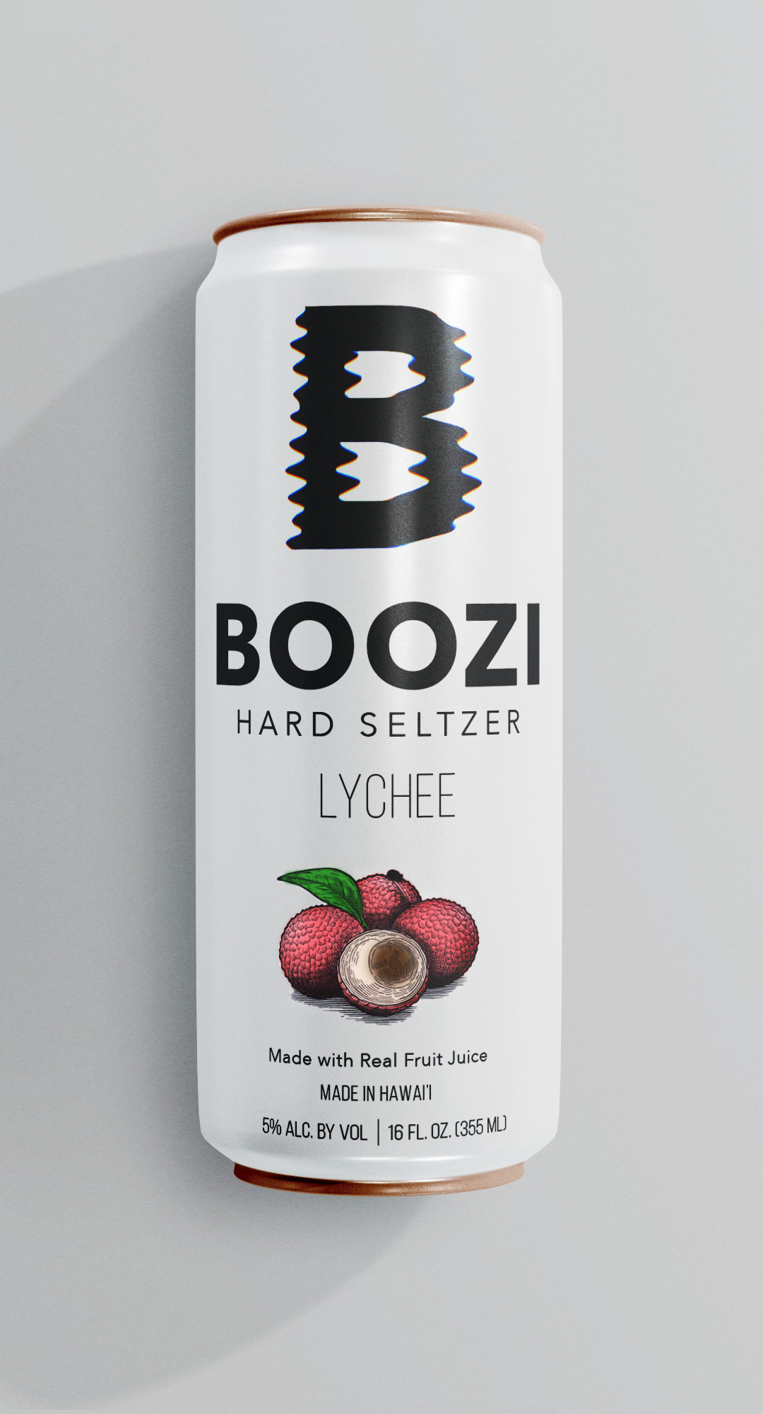
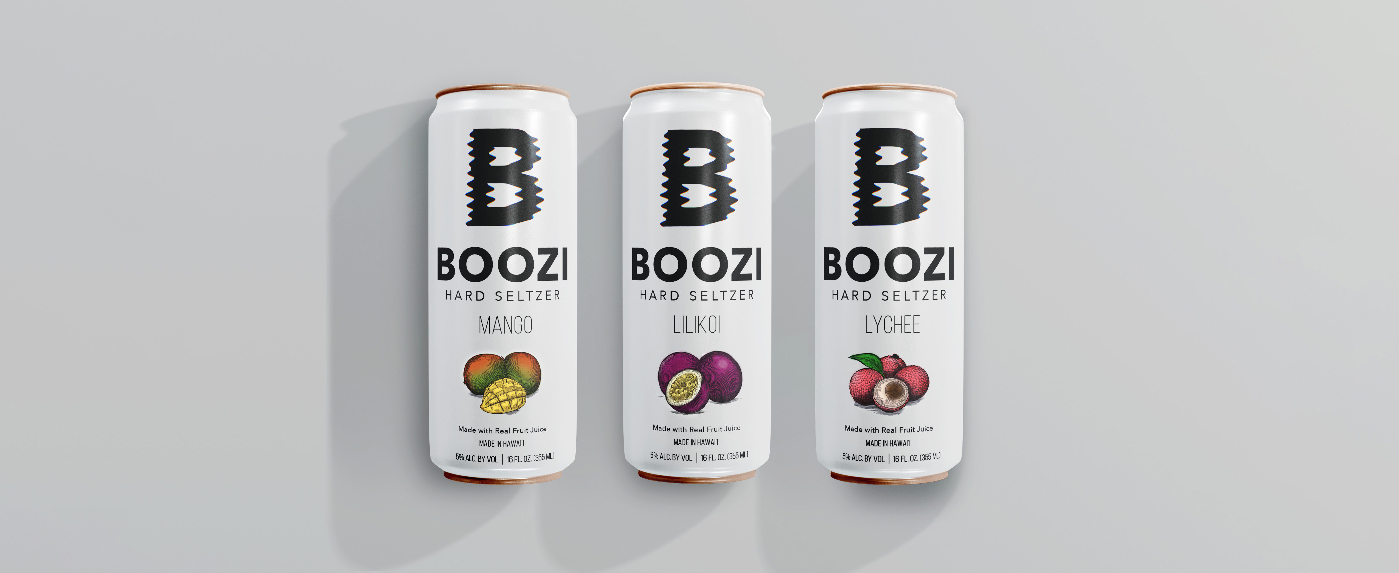
To achieve the objective of creating graphic typography, I experimented with a mix of analog and digital techniques. I printed and scanned the bold, sans serif letter “B,” moving it side to side during scanning to create a ripple effect that mimics the motion of waves. The outcome was perfectly imperfect.
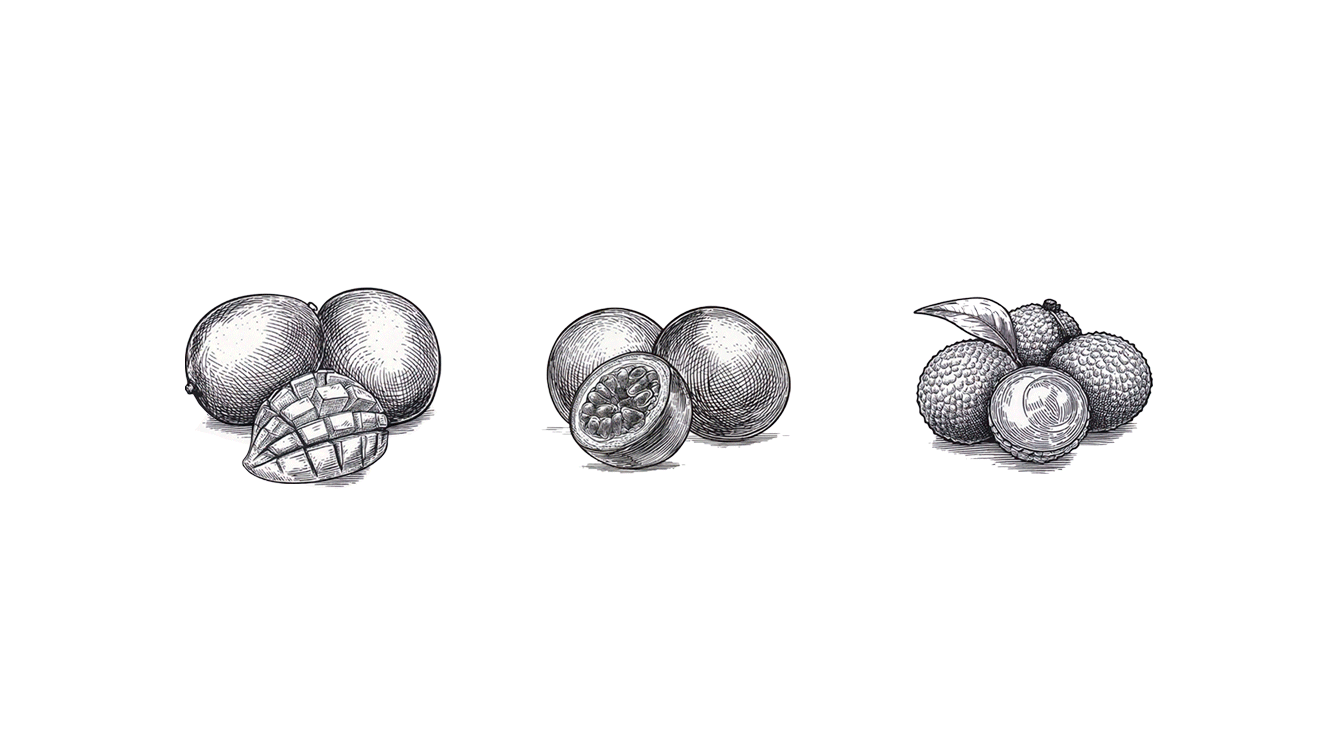
I wanted to connect the flavor to a tropical, refreshing vibe and landed on Lilikoi. To create its visual identity, I experimented with AI-generated imagery until I achieved the desired look. The image was initially black and white, so I brought it into Photoshop and hand-colored it to achieve a realistic fruit appearance.
To expand on the original assignment, I developed two additional flavors—mango and lychee—using the same AI-assisted process. This approach ensured that all three visuals maintained a cohesive style.