- Client: Student Project
- Project Type: Brand Identity
- Software: Adobe Illustrator and Photoshop
 Pele Silver
Araw
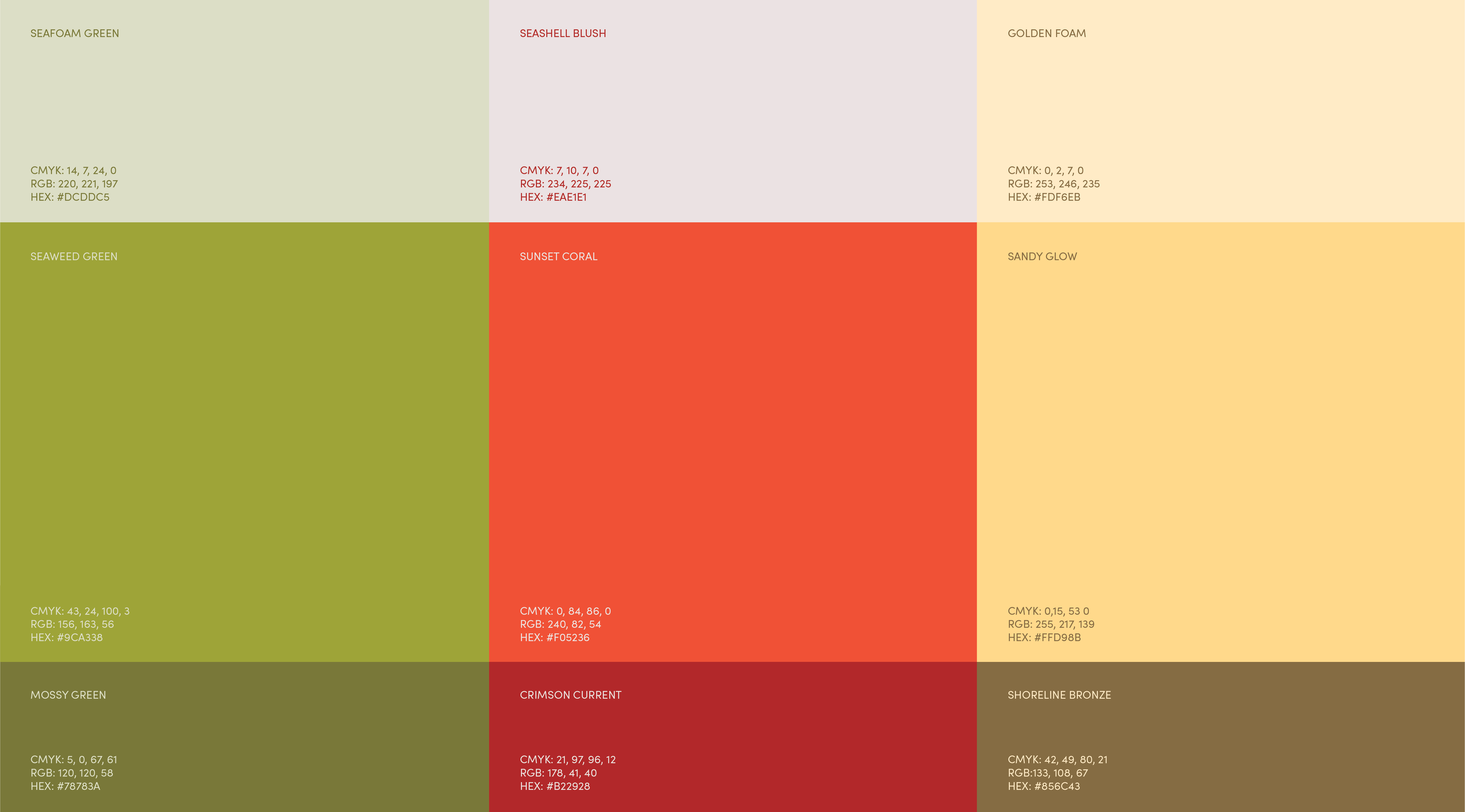
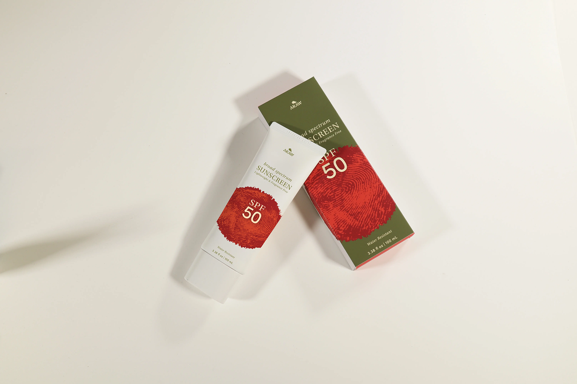
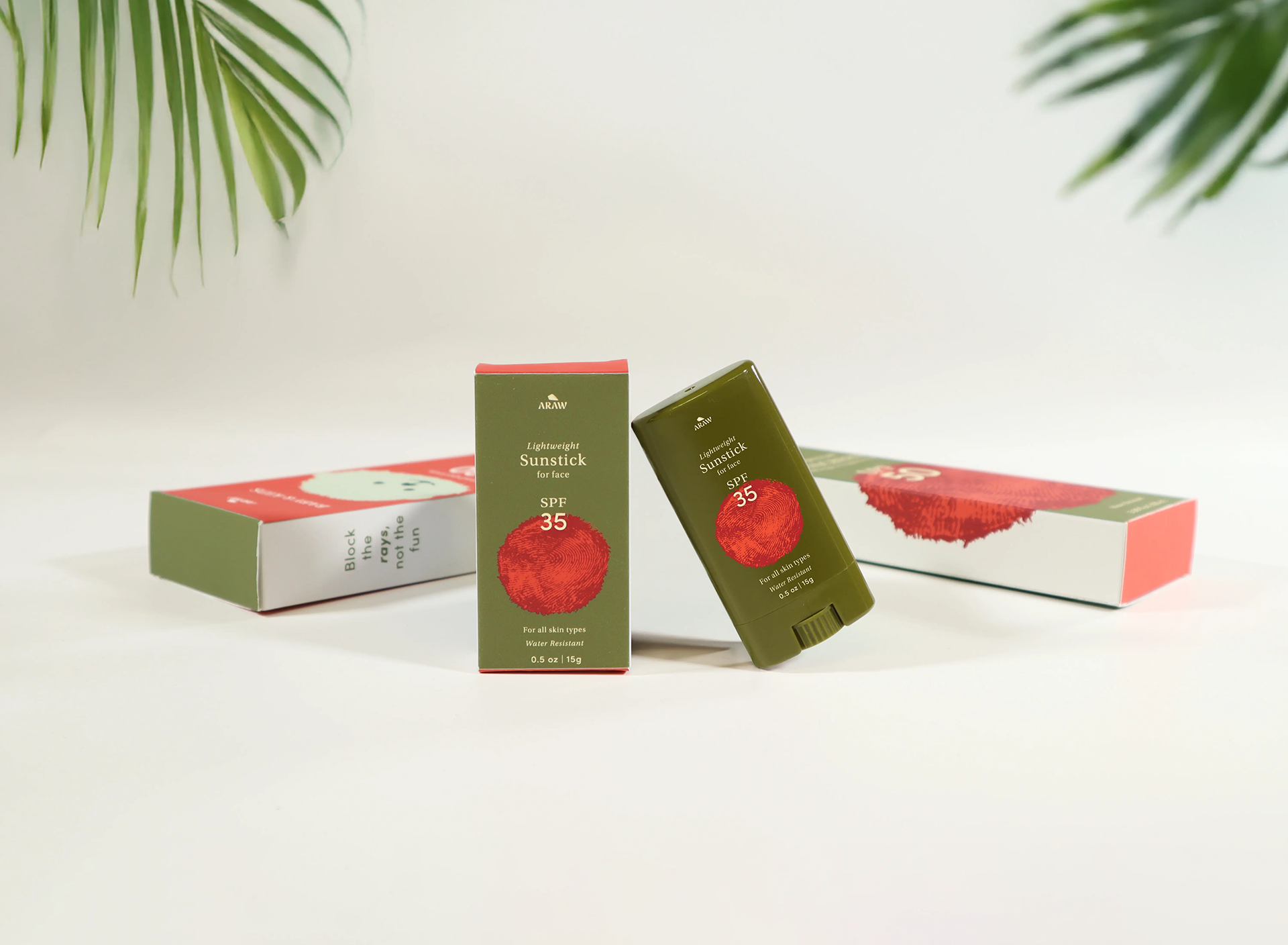
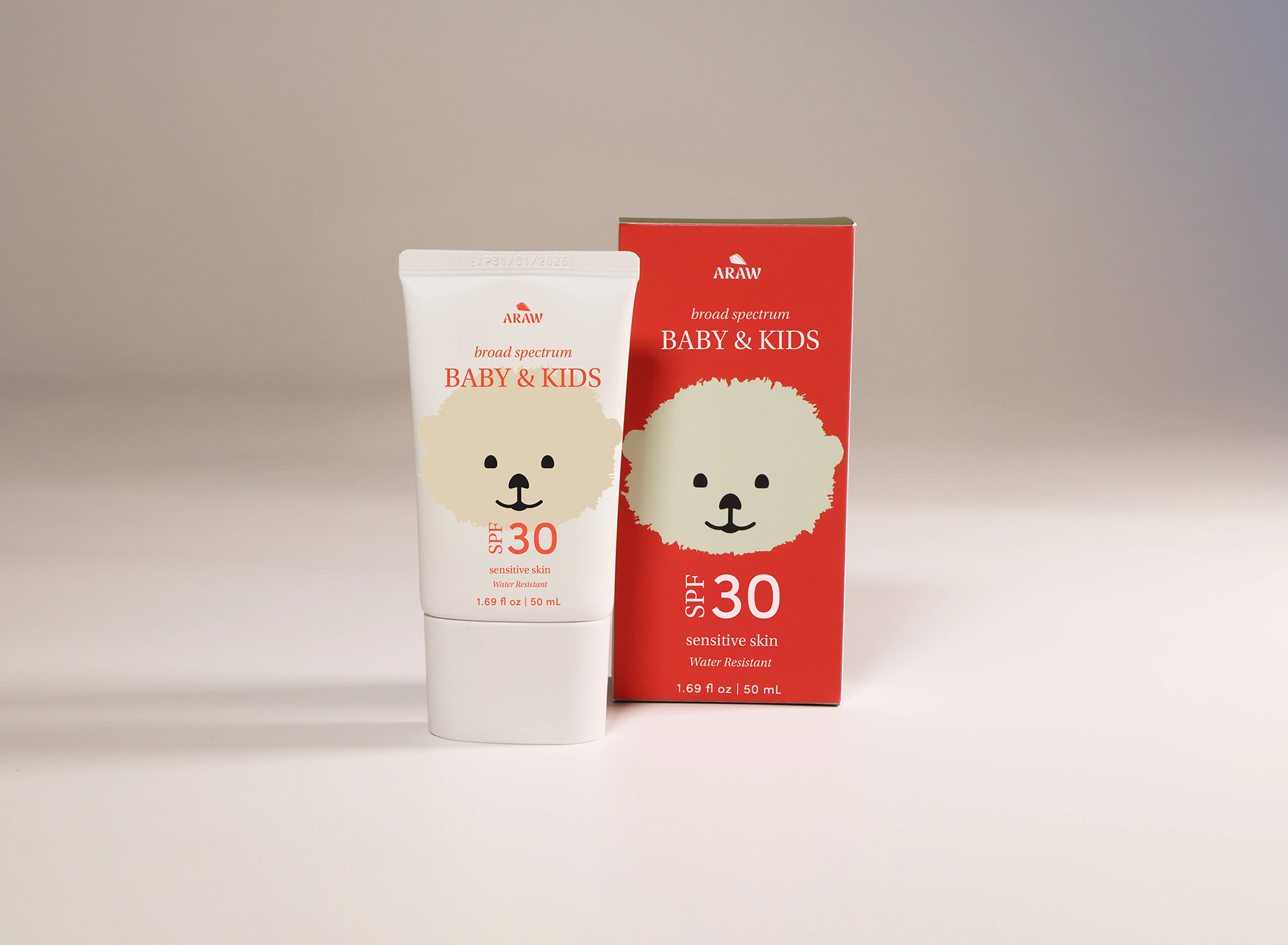
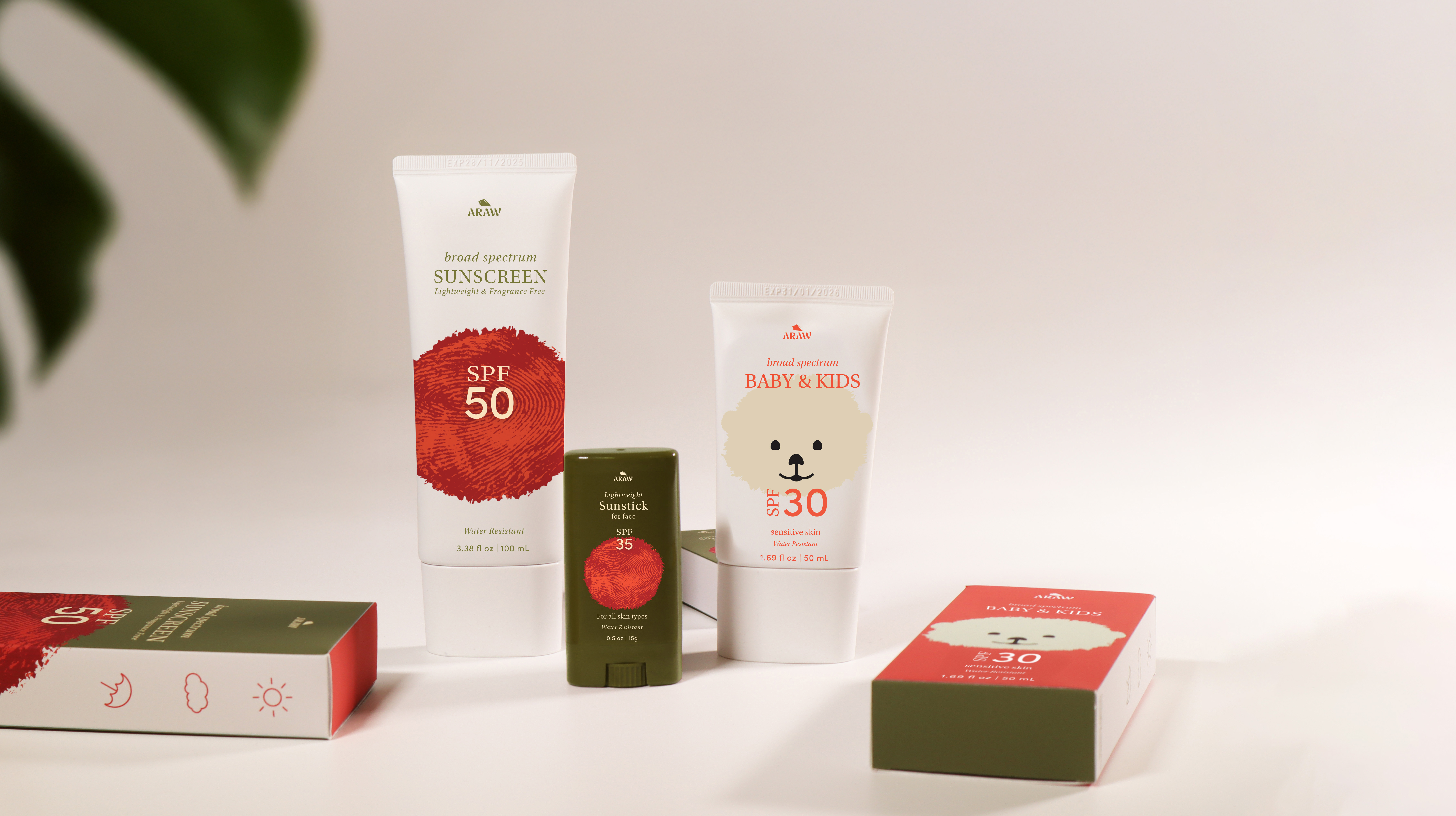
To create brand elements for Araw, I started by conducting thorough research to understand the essence of the brand and its values. I explored various design concepts, paying close attention to color schemes and textures that would evoke a sense of sun, protection, and freshness. This helped me develop a clear vision of the look and feel. I focused on creating a modern, clean aesthetic that reflects Araw's commitment to high-quality, effective skincare. Ultimately, the goal was to design a product that would resonate with consumers while being functional and visually appealing.
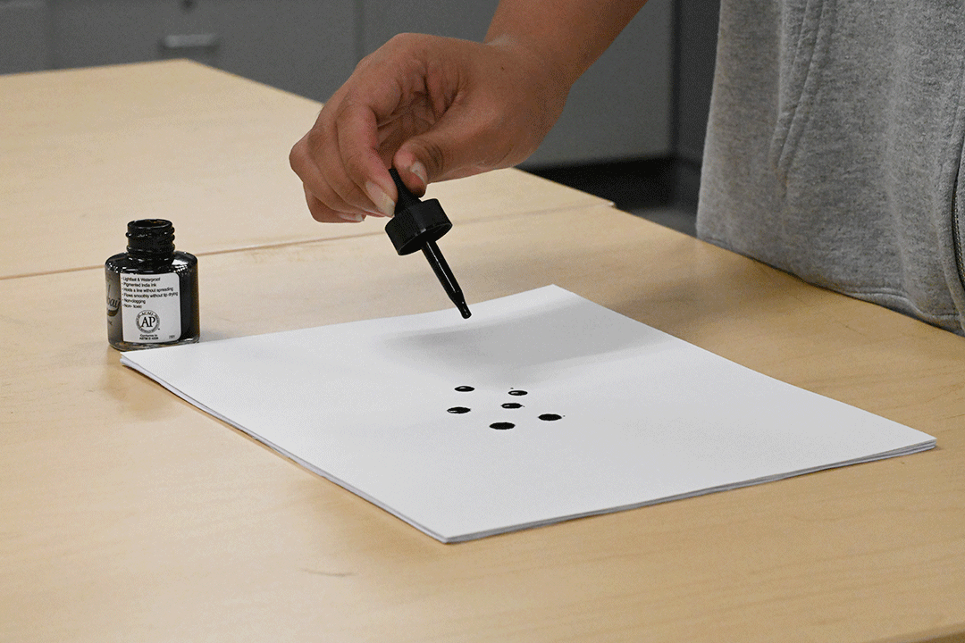
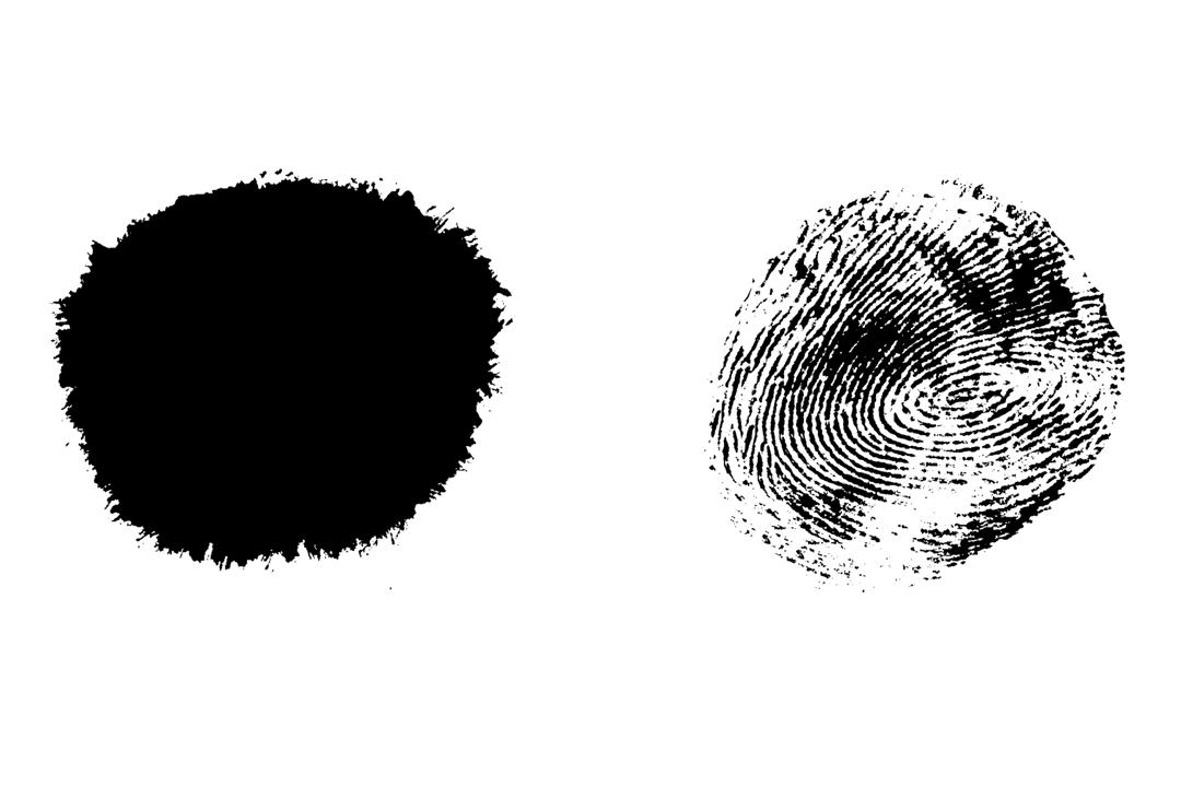
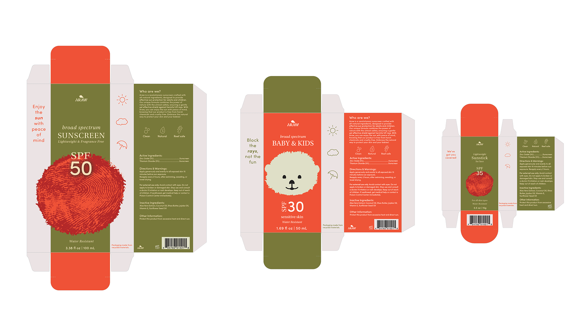
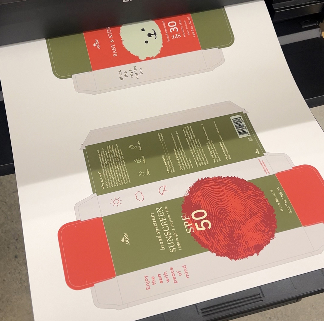
For my brand assets, I stepped away from the digital realm and embraced a more organic, hands-on approach to designing the otter's head. I experimented with ink droplets on paper, exploring different shapes and patterns until I landed on the perfect one. Once I found it, I scanned the droplet into the computer and refined the details digitally. That single ink droplet became a central design element—doubling as the sun in the adult sunscreen and the otter in the baby sunscreen.
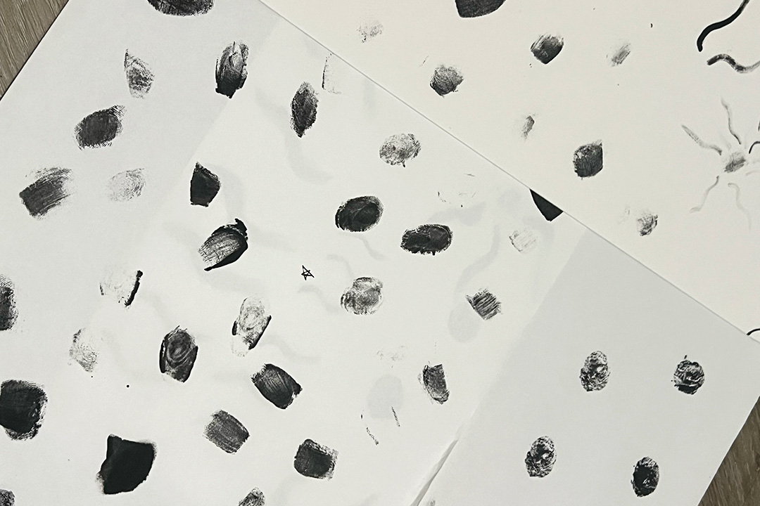
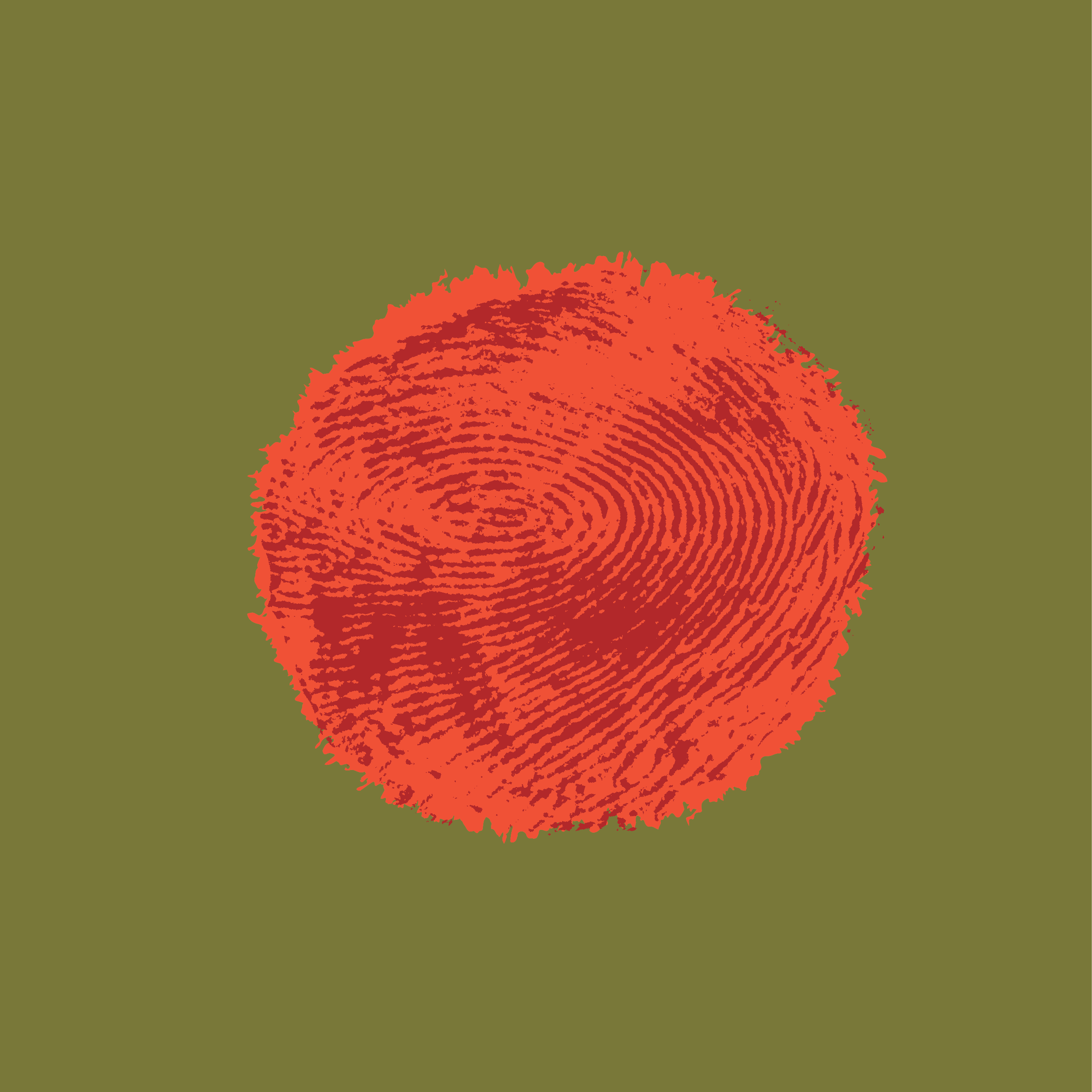
For the adult sunscreen specifically, I wanted the sun to feel as lifelike and textured. To capture its natural imperfections and depth, I painted my fingers to transfer the ridges of my fingerprints onto paper. These unique patterns became the foundation for the sun's organic lines and soft shadows, adding a tactile, human element that made the design feel warm and dynamic.